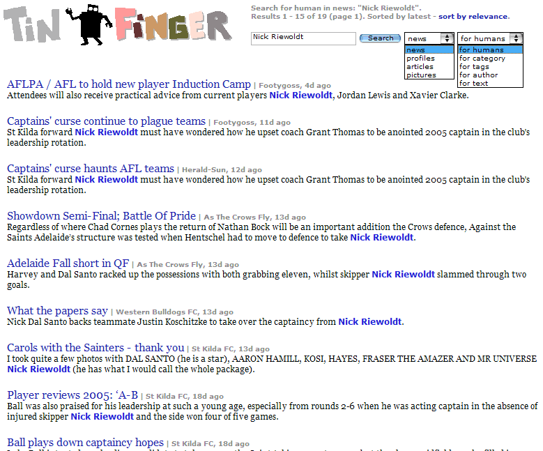
Boolean search into Doc Searls finds a long term hack, plus Tinfinger screenshot 3
 While I wait for the latest DJ mix from the inestimable Solcofn to download, my mind is wandering. What sounds more ridiculous, that "I wish I knew how to quit you" line from Brokeback Mountain, or Doc Searls asking Larry Page if Google is "a long term hack on the producer-consumer relationship"? He asked him that? Really? And no one around him sniggered?
Speaking of Google, as everyone is these days (Eric Schmidt screaming NO WE ARE NOT DOING A PC SO STFU ABOUT IT), we're going to include fulltext Boolean searches on our content, for which a rather boring screenshot is displayed at right. You may ask: why not just rely on Google's Site Search feature complete with insta-monetisation? I don't trust any external crawler to cover our index as well as it can be done internally. Particularly since our searches will cover a matrix of different kinds of content.
 As you can see, the search function includes two dropdown menus, rendered open at the same time here through the special magic of screenshot technology, though you couldn't see them both open in a browser normally. We've got the search code working pretty well now, even with Boolean modifiers.
Of course, this leads to a rather evil temptation to make the Tinfinger front page not like Memeorandum's front page (or like the first screenie) as I had thought initially, but more like Google, so that instead of Google's row of links to " Web Images Groups News more » ", we'd have News Profiles Articles Pictures more » and a big friendly search box. Or something along those lines. Our design is certainly as stripped down and whitespaced as Google's, not through conscious design but more like going through the same thought processes, I guess - a repudiation of the over-busy and over-produced interfaces at more established portal-style sites. Minimalism is good, despite what Ferris Bueller said about isms.
One advantage of the Google home page is that it's dead clear what you are supposed to do when you get there, something which the seminal blog entry at antenna on the Flickr-as-MMOG meme termed as a primary "plot".
This backbone gives users an immediate sense of the “story” of the site. But this central narrative exists in a space which allows for relatively freeform interaction, and the UI also helps nudge users off the main path with teasers like “Do you have a Cameraphone? Learn how to send photos to Flickr.” Like a video game, there’s a sense of progressive disclosure.
The front page to a Web 2.0 site should be like the newbie area of a MMOG. Ideally, you'd like the user to have a strong sense of what to do next, rather than just looking at the pretty environment. Noob quests are essential to drawing a user into the site's narrative, if not full-scale tutorials. Thus a frontsipiece with little other than the name of the game and a pointer to the first quest is optimal.


1 Comments:
I also like ....
"Ferris: I do have a test today. that wasn't bullshit. It's on European socialism. I mean, really, what's the point? I'm not European. I don't plan on being European. So who cares if they're socialists? They could be fascist anarchists. It still doesn't change the fact that I don't own a car. "
Thanks for the plug and nice blog!
-Phil
Post a Comment
<< Home